In the age of GPS, google maps, indoor positioning systems (IPS) and touch screen mapping kiosks, the notion of intuitive wayfinding for building design can seem quaint. However, technology will not eclipse the need for intuitive wayfinding. Good building design provides its occupants with points of reference though architectural cues. “Monuments”, views and architectural vocabulary should be used to help the public find their way instinctively.

Designing a new building provides the team the largest opportunities to employ these devices for orientation. Courtyards, lobbies, external views (pond, playground or field) and other common spaces are great visual references to get a sense of one’s location in a building. With a new building, it is easier to configure the building geometry to maximize these opportunities through axial corridors organized around a common monument. Each entrance in a large building is given its own unique character to reinforce its sense of place while still being within the context of the larger building appearance.
With renovations, we still have several methods we can use to help occupants feel a sense of place and orientation. Colors and element families are part of that toolbox. At the on several school projects, Banwell Architects assigned signature geometric shapes and colors to each “class house” and wing to help students feel a sense of place and navigate their school.
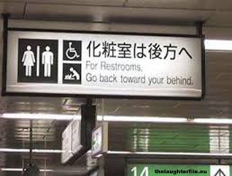
Signage is still needed but should be a supportive, instead of the primary, wayfinding element. These elements can provide clarity on wayfinding, while simultaneously imposing a design theme that will be unique and unifying for the building.
At Banwell Architects, we understand the need for providing a sense of place and orientation in building design.
